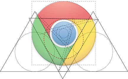
Case Study on Google chrome logo
GOOGLE CHROME LOGO
Case study to describe the making of this logo
Arvind Singh
Student of Applied Arts
College of Arts and Craft
Faculty of Fine Arts, University of Lucknow
Abstract
The purpose of this case study is to obtain a better understanding of how we can make exact copy of Chrome logo with the help of design principal and by using Golden ratio. In this case study we are going to understand the mathematical calculation behind the Chrome logo. This case study is completely based on the practical approach and experiments conducted.
Logo History
The Chrome logo is a registered trademark of Google Inc. It changed several times, but the general concept remained the same: a colorful circle divided into four color segments. The palette and design of the web browser logo is a nod to the famous “Google”
lettering that combines blue, red, yellow, and green letters in a circular shape. The parent company’s original logo was invented by the American entrepreneur and scientist Sergey Mikhaylovich Brin, using GIMP to implement his idea. The multicolored text mark that became the basis for the Chrome symbol was introduced in the late 1990s. Almost twenty years after this event, the corporation acquired its browser. It appeared in 2008, and with it a 3D-style circular emblem. The developers have achieved a three-dimensional effect thanks to smooth gradient transitions, dark, almost black shadows, and white highlights. This makes the surface appear smooth and shiny. The Chrome logo depicts some technological innovation. Inside is a large blue ball located in the very center. Along the edges are three raised curved panels: yellow, green, and red. Shallow light gray furrows are visible on the yellow segment.
In 2011, the 3D emblem was replaced by a flat 2D artwork reminiscent of the new Chromium icon. As designer Steve Rura admitted, this was done to show the simplicity, accessibility, and speed of Chrome. Despite the significant simplification of the graphics, the gradient has not disappeared. The artists left a shift in shades from dark (at the edges) to lighter (closer to the center). In doing so, they placed the blue circle in a wide white ring, separating it from the multicolored fragments.
2011 Google Chrome Logo
By using Golden ratio in Circle and Equilateral triangle
When we apply the Golden ratio on chrome logo, we find that it goes well and
there is use of every single part of circle in golden ratio.
Golden ratio in Circle
If we have circle with diameter X and if we are using the resized circle in ratio of 1/1.618 then it follow the golden ratio principle
Golden ratio in Equilateral Triangle and inscribed Circle
If we have circle with diameter X and if we are using the resized circle in ratio of 1/1.618 then it follow the golden ratio principle.


.png)
Comments